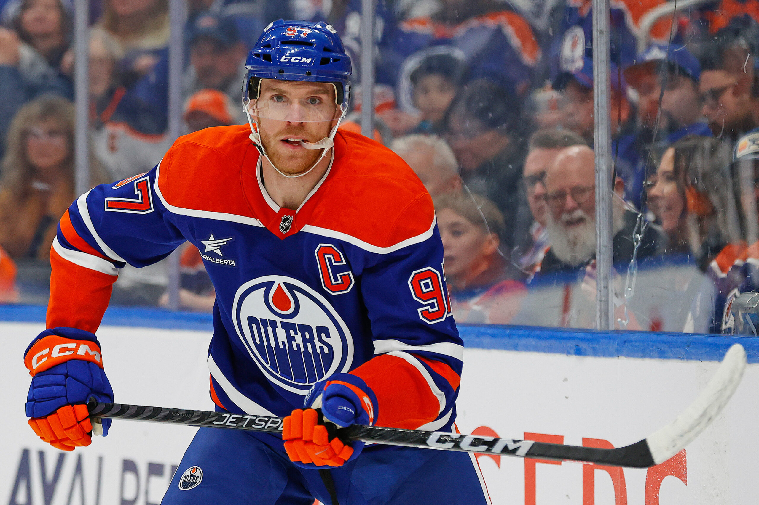
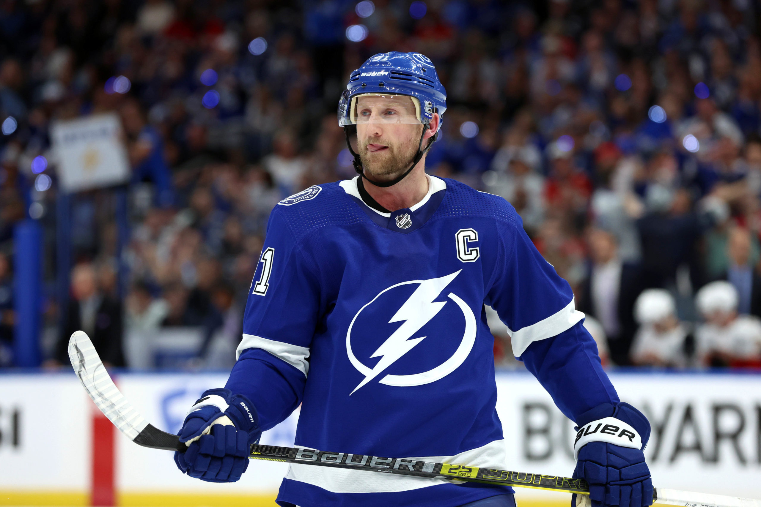
With the series wrapped up, this week's edition of Analytics Advantage breaks down why the Florida Panthers claimed back-to-back titles over the Edmonton Oilers. Florida took the final 4–2, winning three of the last four games by a dominant 16–4, including a 5–1 clincher on home ice. Conn Smythe winner Sam Bennett capped off his MVP run with 15 playoff goals, while Sergei Bobrovsky was stellar in net, most notably making 28 saves in Game 6. Edmonton's star duo, Connor McDavid and Leon Draisaitl, were held in check, and Corey Perry has lost in the finals in five of the last six years.
Let's start with how the goalies fared.
Goals Saved Above Average (GSAA) vs Expected Goals Against (xGA)
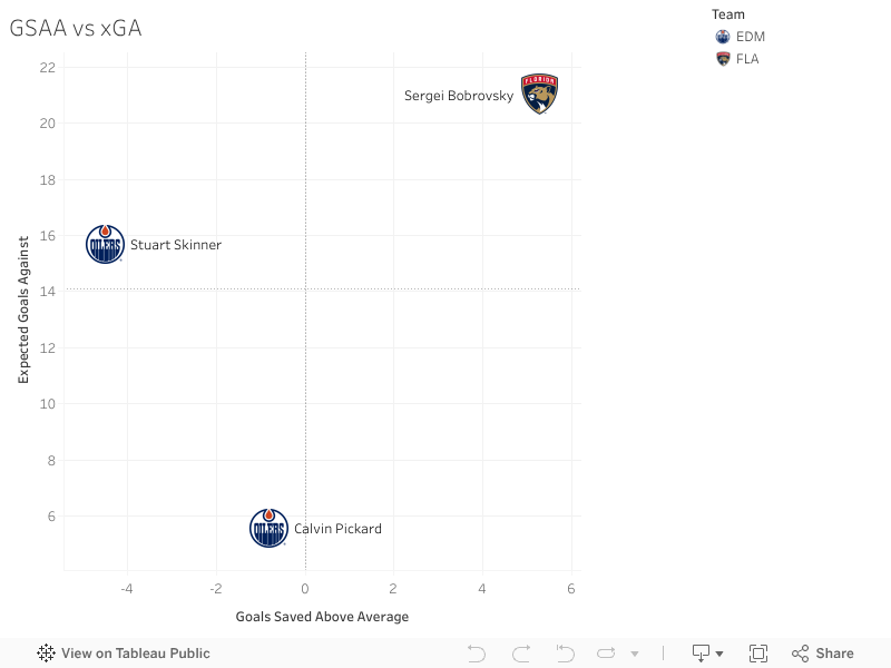
This chart looks at goaltending performance based on GSAA on the X-axis and xGA on the Y-axis. Goalies up and to the right are playing above expectations and handling a heavy workload. Bottom left is the opposite , struggling and not facing much.
There are only three goalies in this chart, but they tell the story. Sergei Bobrovsky lands firmly in the top right. He faced the highest expected workload and still saved more than expected. That kind of series can swing a Cup Final, and it did.
Stuart Skinner and Calvin Pickard sit to the left, with below-average results despite average xGA. Neither was able to step up in the way Bobrovsky did. That gap in goaltending played a big part in how this series ended.
Average Shot Distance vs Save Percentage
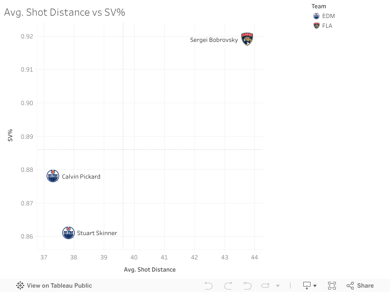
This chart maps average shot distance faced on the X-axis and save percentage on the Y-axis. Goalies in the top right are handling their shots well, even from up close. Bottom left means trouble, soft saves and close-range exposure.
The story is similar to the last chart. Sergei Bobrovsky leads the way again with a strong save percentage even if he faced a much further average shot distance. Calvin Pickard comes out slightly ahead of Stuart Skinner here, posting better numbers overall, but it's worth noting that Skinner played the heavier minutes across the series.
This chart doesn't offer much beyond reinforcing what we already know: Bobrovsky stepped up. Edmonton's goalies didn't.
Offensive Zone Starts vs Defensive Zone Starts
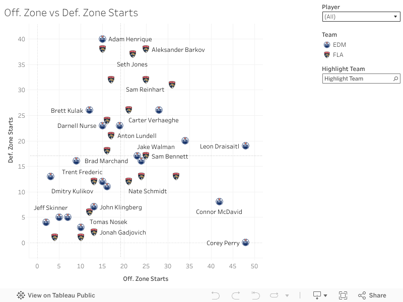
This chart breaks down deployment: Offensive zone starts on the X-axis and Defensive zone starts on the Y-axis. Players at the top are trusted in their own zone. Players on the right get most of their starts in the offensive zone. Middle six guys usually land in the center, while specialists or high-leverage players show up on the extremes.
Looking at the top of the chart, we see more Panthers than Oilers, which tells the story. Adam Henrique, Niko Mikkola, and Seth Jones all saw heavy defensive usage, and the Panthers options weren't alone as Florida had multiple players they could trust in tough spots. Edmonton, on the other hand, leaned almost entirely on Henrique for shutdown shifts. There just weren't many other answers.
Offensively, the McDavid-Draisaitl-Perry line shows up heavily tilted toward the right, along with Evan Bouchard , as well as Evan Rodrigues for the Panthers. These were the go-to creators when the Oilers needed zone pressure.
At the bottom left, you'll find role players and bottom-six skaters who didn't start many shifts at either end, often coming on during line changes. The middle of the chart is full of middle-six contributors who handled a mix of deployments without being leaned on too heavily in one direction.
PDO vs CorsiFor%
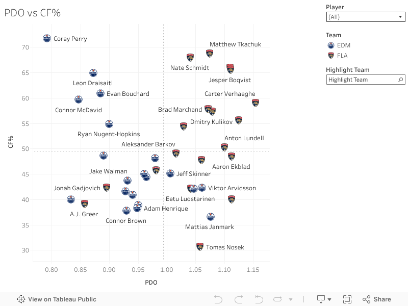
This chart maps PDO (a combination of shooting% and save%) on the X-axis against CorsiFor% on the Y-axis. The top right is where you want to be, driving play and getting the bounces. Bottom left is the worst-case zone, low impact and no luck.
Looking at the chart, the split between the two teams is clear. Only four Oilers finished above average in puck luck (PDO): Mattias Janmark, Viktor Arvidsson, Vasiliy Podkolzin, and Jeff Skinner. Everyone else was either unlucky, ineffective, or both. In contrast, only three Panthers fell below the average line for puck luck, and even those players still benefited from strong team-level support.
One standout here is Corey Perry. He had a strong impact on shot share and play-driving but landed well below the PDO line. It's hard not to wonder how different this series could've looked if a few more bounces went his way, or the Oilers' way in general.
The data backs it up: Florida didn't just get lucky, they showed up across the board. Their best players were productive, and their depth players were involved. Edmonton's stars produced too, but the support fell short, and the luck wasn't on their side.
Expected Goals For (xGF) vs Actual Goals For (GF)
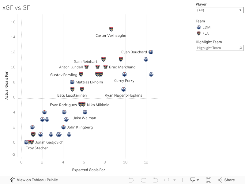
This chart plots expected goals for (xGF) on the X-axis and actual goals for (GF) on the Y-axis. The top right is the sweet spot, you're generating quality chances and actually finishing them. Bottom left is where things stall out, low shot quality and low results.
Once again, the trend holds. Florida dominates the top right quadrant, with most of their roster producing as expected, or better. Carter Verhaeghe stood out in particular, sitting high on both axes after a standout offensive series.
In contrast, only five Oilers show up in a productive spot. Beyond the top performers, the rest of the team fell short. Edmonton's bottom six in particular is clustered in the bottom left, a clear sign that depth scoring never arrived. They had chances, but the finish just wasn't there.
Florida, on the other hand, had only a few players in that bottom left zone. Nearly everyone contributed, which shows up clearly here. That level of all-line scoring pressure was a difference-maker.
Expected Goals Against (xGA) vs Goals Against (GA)
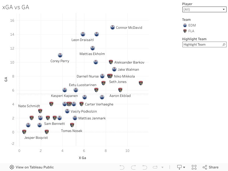
This chart shows expected goals against (xGA) on the X-axis and actual goals against (GA) on the Y-axis. Bottom left is the ideal zone, low danger allowed and low goals against. Top right is where things fall apart, allowing chances and getting scored on.
Here, the split is once again clear. Florida has a healthy cluster of players in the bottom left, showing strong defensive structure and execution. Edmonton, on the other hand, has far too many skaters landing in the top right; overexposed, overrun, and beaten.
Some Oilers were just stuck on the wrong end of things, getting peppered and giving up goals. Others weren't involved much at all, floating in the lower left with little defensive workload or impact. That's not necessarily a good sign, either. It points to a team leaning too heavily on a small group instead of a full-unit effort.
At the end of the day, Florida played like a team, while Edmonton leaned on a few stars. When the structure breaks down, the goalie struggles, and the bounces go the other way, it's just not enough to win. That's what happened here.
Edmonton has proven they're the class of the West. But beating Florida, and winning a Cup, means being the best team in the league. They're not there yet, and this offseason will be about figuring out how to close that gap.
Thanks for checking out this Stanley Cup Final breakdown. From puck luck to zone deployment to goaltending pressure, the numbers give us a clearer picture of why Florida came out on top. If you want to dig into the charts yourself, use the filters and team views in each Tableau tab. As always, feel free to reach out on Twitter @DH_staspup if you've got questions or want to talk hockey. See you next week.
Related Posts

UPCOMING GAMES
| Oct 07 - 17:10 |
| vs |
| |
| Oct 07 - 20:10 |
| vs |
| |
| Oct 07 - 22:10 |
| vs |
| |
Starting Goalies
Top Skater Views
| Players | Team | |
|---|---|---|
| TYSON FOERSTER |
| |
| SAM RINZEL |
| |
| JACKSON BLAKE |
| |
| PAVEL DOROFEYEV |
| |
| NOAH CATES |
| |
Top Goalie Profile Views
LINE COMBOS
| Frequency |
| |
|---|---|---|
| 25.8 | NICK SCHMALTZ ALEXANDER KERFOOT CLAYTON KELLER | |
| 17.5 | DYLAN GUENTHER LAWSON CROUSE LOGAN COOLEY | |
| 17.2 | AKU RATY JACK MCBAIN MATIAS MACCELLI | |
DobberHockey Podcasts

Keeping Karlsson: Red Boys of 2024-25
Elan and Brian dig into the NHL players who started strong but sputtered badly in the second half of 2024-25, and how much this impacts their desirability for 2025-26 NHL fantasy hockey drafts.

Fantasy Hockey Life: Ottawa Senators with Alex Adams
Alex Adams of Sportsnet is here to report on the Ottawa Senators. Jesse and Victor interview Alex about returning pros Tim Stutzle, Drake Batherson, Brady Tkachuk, Dylan Cozens, Claude Giroux, Shane Pinto, Ridly Greig, Fabian Zetterlund, Jake Sanderson, Thomas Chabot, Jordan Spence, Linus Ullmark, and Leevi Meralainen. In Cat’s Instincts, Cat Silverman of InGoal mag […]
Fantasy Hockey Life: Washington Capitals Preview with Dan Holmi of Locked on Caps
Dan Holmi is here to report on the Washington Capitals. Jesse and Victor interview Dan about returning pros Alex Ovechkin, Dylan Strome, Aliaksei Protas, Pierre-Luc Dubois, Tom Wilson, Connor McMichael, Ryan Leonard, John Carlson, Jakob Chychrun, Rasmus Sandin, Logan Thompson, and Charlie Lindgren. In Cat’s Instincts, Cat Silverman of InGoal mag breaks down Garin Bjorklund. […]
Keeping Karlsson: Green Boys of 2024-25
Elan and Brian set their sights on NHL players who saved their best for last in 2024-25 — and wonder whether their projections should look more like their slow start, or hot finish.
Fantasy Hockey Life: Stefan Rosner on the New York Islanders
Stefan Rosner is here to report on the New York Islanders. Jesse and Victor interview Stefan Rosner about returning pros Bo Horvat, Anders Lee, Mathew Barzal, Simon Holmstrom, JG Pageau, Maxim Tsyplakov, Calum Ritchie, Noah Dobson, Ryan Pulock, Alexander Romanov, Scott Perunovich, and Ilya Sorokin. In Cat’s Instincts, Cat Silverman of InGoal mag breaks down […]