

Analytics Advantage: Hypothetical All-Star Teams and Top Performers at 5-on-5, Including Gauthier, Matthews, Guenther, Arvidsson, and More
Stas Pupkov
2026-02-20
As the Olympic break comes to an end, I wanted to do a special edition of Analytics Advantage. This week is split into two parts. First, I put together a "what if" scenario: what the NHL All Star Game might have looked like this season if it was hosted on Long Island. Second, I shift into a Tableau visualization that highlights the top five-on-five players this year, using a few different graph angles to show which skaters have driven play and produced at the highest level at even strength.
The All Star portion is not meant to be a perfect projection. In a typical format, 32 players are selected initially, then 12 additional players are voted in by fans. Injuries, replacements, and players opting out can change the final rosters as well. With that in mind, this is still a strong snapshot of what an All Star weekend in New York could have looked like this season based on performance and star power.
All Star Snubs
Note: 32 players are selected initially, then 12 are voted in by fans, with additional changes possible due to injuries and replacements.
Snubs: Cutter Gauthier (ANA), Morgan Geekie (BOS), Charlie McAvoy (BOS), Tage Thompson (BUF), Brock Nelson (COL), Jason Robertson (DAL), Miro Heiskanen (DAL), Wyatt Johnston (DAL), Alex DeBrincat (DET), Dylan Larkin (DET), Brad Marchand (FLA), Cole Caufield (MTL), Matt Boldy (MIN), Filip Gustavsson (MIN), Ryan O'Reilly (NSH), Jake Guentzel (TBL), Darren Raddysh (TBL), Brandon Hagel (TBL), Auston Matthews (TOR), Nick Schmaltz (UTA), Mitch Marner (VGK), Kyle Connor (WPG).
I likely missed a few, so if you have a favorite snub, feel free to drop it in the comments.
Mock All Star Teams
Atlantic Division
• Boston Bruins: David Pastrnak (F), Jeremy Swayman (G)
• Buffalo Sabres: Rasmus Dahlin (D)
• Detroit Red Wings: Lucas Raymond (F)
• Florida Panthers: Sam Reinhart (F)
• Montreal Canadiens: Nick Suzuki (F), Lane Hutson (D)
• Ottawa Senators: Tim Stutzle (F)
• Tampa Bay Lightning: Nikita Kucherov (F), Andrei Vasilevskiy (G)
• Toronto Maple Leafs: William Nylander (F)
Metropolitan Division
• Carolina Hurricanes: Sebastian Aho (F)
• Columbus Blue Jackets: Zach Werenski (D)
• New Jersey Devils: Nico Hischier (F)
• New York Rangers: Mika Zibanejad (F)
• New York Islanders: Mathew Barzal (F), Matthew Schaefer (D), Ilya Sorokin (G)
• Philadelphia Flyers: Travis Konecny (F)
• Pittsburgh Penguins: Sidney Crosby (F)
• Washington Capitals: Jakob Chychrun (D), Logan Thompson (G)
Central Division
• Chicago Blackhawks: Connor Bedard (F)
• Colorado Avalanche: Nathan MacKinnon (F), Cale Makar (D), Martin Necas (F)
• Dallas Stars: Mikko Rantanen (F)
• Minnesota Wild: Quinn Hughes (D), Kirill Kaprizov (F)
• Nashville Predators: Juuse Saros (G)
• St. Louis Blues: Joel Hofer (G)
• Winnipeg Jets: Mark Scheifele (F)
• Utah Mammoth: Clayton Keller (F)
Pacific Division
• Edmonton Oilers: Connor McDavid (F), Evan Bouchard (D), Leon Draisaitl (F)
• Anaheim Ducks: Lukas Dostal (G)
• Seattle Kraken: Jordan Eberle (F)
• Calgary Flames: Dustin Wolf (G)
• Los Angeles Kings: Adrian Kempe (F)
• San Jose Sharks: Macklin Celebrini (F)
• Vancouver Canucks: Filip Hronek (D)
• Vegas Golden Knights: Jack Eichel (F), Mark Stone (F)
Top 5-on-5 Players This Season (Tableau Visualization)
The second part of this week's edition is a Tableau-driven look at the top five-on-five performers this season. The goal is to isolate true even-strength impact and show which players have been driving results when teams are playing real hockey without power play inflation. Each chart highlights a different angle of five-on-five performance, so instead of relying on one metric to tell the whole story, the visuals help separate volume shooters from efficiency scorers, play drivers from passengers, and sustainable profiles from players running hot.
Graph 1: Blowouts
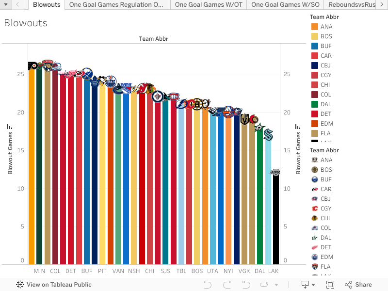
This blowout view is a quick snapshot of which teams have been involved in the most lopsided games in 2025-26, and it works in both directions. A team can show up here because they are regularly getting blown out, or because they are the ones creating separation and running teams off the ice. Philadelphia sits near the top of this list, which fits the profile of a team that has had plenty of rough nights. Minnesota and Colorado also show up heavily, but their context is very different, as those teams have had stretches where they can put games away early when the offense is rolling. At the other end, Los Angeles stands out as one of the teams keeping games tighter more often, with fewer results that turn into true runaways.
Graph 2: One-Goal Games (Regulation Only)
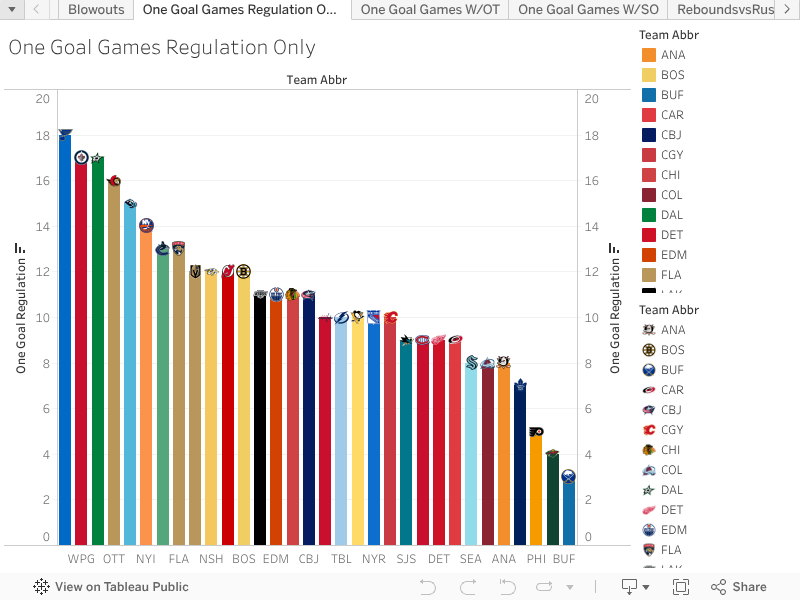
This graph isolates games that ended in regulation with a one-goal margin, which is useful because it filters out overtime and focuses strictly on tight games in 60 minutes. St. Louis and Winnipeg show up as teams living in this space, which lines up with the idea that many of their games are decided late. Dallas appears frequently as well. Meanwhile, teams that show up in the blowout bucket, like Philadelphia and Minnesota, are not nearly as prominent here, suggesting their results have been less coin-flip and more swing-y. Buffalo also stands out as a team that has not played many regulation one-goal games, meaning they have not been in as many tight 60-minute finishes as the teams near the top of the list.
Graph 3: One-Goal Games (Including OT)
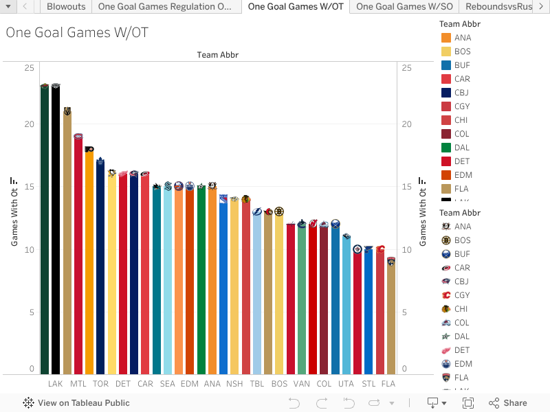
Once you expand to include overtime, the extra time tendencies pop immediately. Minnesota and Los Angeles stand out as teams that have played a lot of one-goal games that go past regulation, which fits the identity of lower-event, tighter games that stay close into the third period. Florida sits much lower in this view, suggesting their outcomes have been more decisive and less likely to drift into overtime. You also see a few teams that have struggled this season show up more here, which can reflect teams that hang around longer than expected, or teams that cannot consistently close games cleanly in regulation.
Graph 4: Shootouts
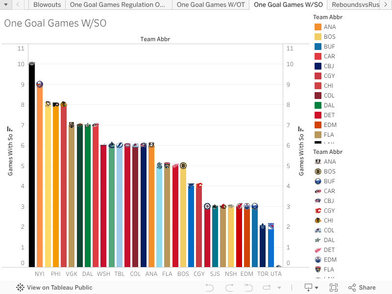
The shootout view is basically the most extreme version of keeping games close. Los Angeles shows up again as a team that has been in a lot of shootouts, which tracks with everything we see about how often their games stay tight. One interesting note from the 2025-26 data: Utah stands out as a team that has not been to a shootout at all this season. It is not a skill takeaway on its own, but it is a real schedule quirk that shows how differently teams can get to their results, even when they are playing a similar number of close games overall.
Graph 5: Rebounds vs Rush Attempts (Per 60)
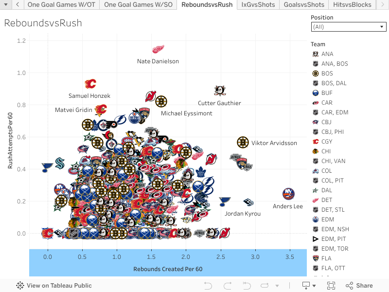
This player chart looks at Rebounds/60 against Rush Attempts/60, which is a clean way to highlight who is actively pushing play in transition and still getting to dangerous second-chance areas. The players clustered in the upper-right quadrant are the ones who consistently carry the puck with pace and turn it into real offense, either by creating chaos around the net or by being directly involved in chances off the rush. Names like Cutter Gauthier, Viktor Arvidsson, Anders Lee, and Nate Danielson stand out here as players who are frequently involved when their teams attack with speed. The takeaway is simple: when these guys have the puck and space, they are not just skating it up the ice, they are turning that rush volume into chances that create follow-up opportunities.
Graph 6: Individual xG/60 vs Shots/60
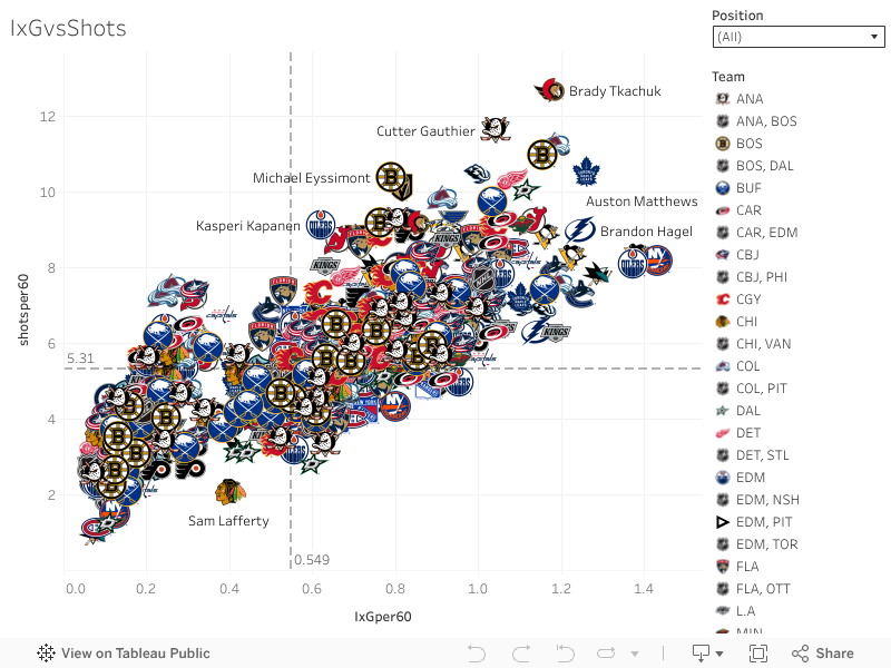
This chart plots Individual Expected Goals For/60 against Shots/60. It is essentially a shot volume plus chance quality view, and the upper-right corner is the sweet spot: players who fire a ton and generate dangerous looks while doing it. Brady Tkachuk jumps out as a classic example of a player who constantly pushes the pace and generates volume, and you also see strong five-on-five engines like Cutter Gauthier, Viktor Arvidsson, Ross Colton, Alex DeBrincat, Jason Robertson, Dylan Guenther, Auston Matthews, Brandon Hagel, Matt Boldy, and Seth Jarvis showing up as well. When a player is high in both shots and individual xG, it usually means they are not just floating perimeter attempts, they are repeatedly getting into the types of areas that translate into goals.
Graph 7: Goals/60 vs Shots/60
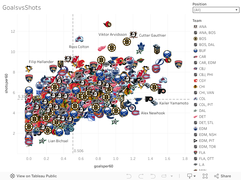
This one keeps the same shot volume lens, but swaps in Goals/60 to show who has been converting at the highest rate this season. It is a quick way to separate pure volume shooters from the players who are pairing volume with finishing. Dylan Guenther, Jack Eichel, Cutter Gauthier, and Auston Matthews stand out as high-end scorers in this view, while Brady Tkachuk again shows up as one of the most consistent pepper-the-net profiles in the league. This chart is not saying everyone near the top will stay there forever, because finishing can swing with shooting percentage variance, but it does highlight the players who have combined opportunity, shot generation, and scoring touch into real five-on-five production so far.
Graph 8: Hits vs Blocks
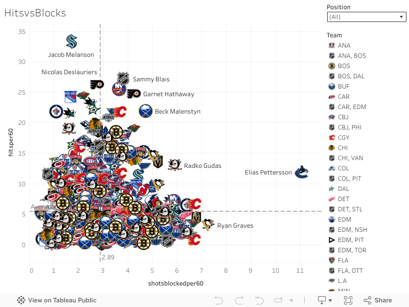
The final player chart moves away from offense and into the peripherals layer: Hits vs. Blocks. This is the quick read for who is actively engaging physically, who is getting in shooting lanes, and who is doing neither. The bottom-left area is where players provide very little in either category, and that is where you see names like Kyle Connor and Artemi Panarin sitting well below the league-average reference line. It is not a critique of their overall value; it is just a clear signal of play style. You also see other skilled players in that low-peripheral cluster who are not going to move the needle in hits or blocks even if they are productive offensively. Meanwhile, the players higher up in either direction are the ones who bring that extra category juice, either by playing heavy and finishing checks, or by consistently getting in lanes and absorbing shots.
Data from MoneyPuck and the NHL API.
Related Posts
Starting Goalies



Top Skater Views
| Players | Team | |
|---|---|---|
| ROOPE HINTZ |
 DAL DAL | |
| ALEX LAFERRIERE |
 L.A L.A | |
| LUKE HUGHES |
 N.J N.J | |
| OWEN TIPPETT |
 PHI PHI | |
| KEVIN FIALA |
L.A
| |
Top Goalie Profile Views
 WSH
WSH CBJ
CBJ MIN
MIN UTA
UTA


LINE COMBOS
| Frequency |
 T.B Players T.B Players
| |
|---|---|---|
| 21.7 | NIKITA KUCHEROV BRANDON HAGEL ANTHONY CIRELLI | |
| 18.8 | NICK PAUL YANNI GOURDE ZEMGUS GIRGENSONS | |
| 18.6 | DOMINIC JAMES GAGE GONCALVES OLIVER BJORKSTRAND | |
DobberHockey Podcasts

Keeping Karlsson: The 2026-27 Keeping Karlsson Breakfast Club
Don’t you forget about them! Elan and Brian remind you of at least one player on each NHL team whose name you might forget to consider at the draft table.

Fantasy Hockey Life: Tampa Bay Lightning with Erik Erlendsson
Erik Erlendsson joins the program to discuss the Tampa Bay Lightning. Jesse and Victor ask about pros Nikita Kucherov, Jake Guentzel, Brandon Hagel, Brayden Point, Anthony Cirelli, Ilya Mikheyev, Gage Goncalves, Conor Geekie, Benjamin Rautiainen, John Carlson, Victor Hedman, Charle-Edouard D’Astous, Andrei Vasilevskiy, Jonas Johansson, and Dennis Hildeby. In Cat’s instincts, Cat Silverman of InGoal […]
Fantasy Hockey Life: New York Rangers with Colin Stephenson
Colin Stephenson joins the program to discuss the New York Rangers.
Keeping Karlsson: Matchup Maximizer Schedule Deep Dive
Elan is joined by the Keeping Karlsson Accountability Czar Trev to take a deep dive into the NHL schedule for next season and how it should affect our drafting decisions.
Fantasy Hockey Life: Carolina Hurricanes with Ryan Henkel
Ryan Henkel joins the program to discuss the Carolina Hurricanes. Jesse and Victor ask about pros Sebastian Aho, Seth Jarvis, Andrei Svechnikov, Nikolaj Ehlers, Jackson Blake, Logan Stankoven, Jordan Staal, Bradly Nadeau, Felix Unger Sorum, Shayne Gostisbehere, K’Andre Miller, Alexander Nikishin, Sean Walker, Brandon Bussi, and Pyotr Kochetkov. In Cat’s instincts, Cat Silverman of InGoal […]