Advanced Metrics: How to Read the Charts
Dobber
2022-06-28
As an extension of our earlier article 'Analytics – What to Use for Fantasy Hockey and Why', we go over a couple of important analytics charts that are provided in our Frozen Tools section.
First, we'll pull the summary "Advanced Stats" report for 2021-22. A team was selected at random, in this case – Detroit.
| Name | GP | ZS% | PDO | 5on5 SV% | 5on5 S% | CF% | %PP | IPP | ES IPP | PP IPP | PTS/60 | Sec Asst | Sec Asst % |
| DYLAN LARKIN | 71 | 51.1 | 995 | 0.896 | 9.9 | 49.3 | 60.2 | 71.1 | 78.9 | 52 | 3 | 12 | 31.6 |
| JAKUB VRANA | 26 | 53.5 | 986 | 0.898 | 8.8 | 46.7 | 51.7 | 90.5 | 92.9 | 85.7 | 2.9 | 1 | 16.7 |
| TYLER BERTUZZI | 68 | 51.2 | 1010 | 0.909 | 10.1 | 48.8 | 60.9 | 66.7 | 71.9 | 51.9 | 2.8 | 14 | 43.8 |
| LUCAS RAYMOND | 82 | 52 | 985 | 0.902 | 8.3 | 49 | 59.8 | 65.5 | 70.7 | 62.1 | 2.3 | 19 | 55.9 |
| ROBBY FABBRI | 56 | 50.9 | 991 | 0.914 | 7.7 | 47.3 | 57.5 | 58.8 | 66.7 | 44.4 | 1.9 | 3 | 23.1 |
| OSKAR SUNDQVIST | 18 | 39.3 | 1046 | 0.926 | 12 | 41.7 | 30.4 | 52.4 | 56.4 | 0 | 1.7 | 0 | 0 |
| SAM GAGNER | 81 | 42 | 995 | 0.911 | 8.4 | 46.2 | 13.8 | 66.7 | 70 | 33.3 | 1.6 | 4 | 23.5 |
| NAMESTNIKOV | 60 | 44.5 | 1010 | 0.925 | 8.5 | 46.5 | 7 | 62.5 | 66.7 | 25 | 1.6 | 5 | 41.7 |
| MORITZ SEIDER | 82 | 45.1 | 1006 | 0.919 | 8.7 | 47 | 61.8 | 45 | 36 | 65.6 | 1.6 | 23 | 53.5 |
| PIUS SUTER | 82 | 52.1 | 999 | 0.92 | 7.9 | 46.7 | 28.6 | 65.5 | 67.3 | 75 | 1.6 | 7 | 33.3 |
| TARO HIROSE | 15 | 39.3 | 991 | 0.893 | 9.8 | 44.8 | 32.3 | 57.1 | 40 | 100 | 1.5 | 1 | 33.3 |
| RASMUSSEN | 80 | 40.8 | 974 | 0.894 | 8 | 43.4 | 19 | 60 | 64.1 | 33.3 | 1.4 | 4 | 33.3 |
| FILIP ZADINA | 74 | 49.8 | 974 | 0.904 | 7 | 48.3 | 39.2 | 53.3 | 45.7 | 80 | 1.4 | 9 | 64.3 |
| FILIP HRONEK | 78 | 46.3 | 992 | 0.905 | 8.7 | 45.8 | 41.4 | 49.4 | 47.7 | 63.6 | 1.3 | 15 | 45.5 |
| CARTER ROWNEY | 26 | 38.7 | 989 | 0.875 | 11.4 | 42.1 | 0.4 | 46.2 | 41.7 | 0 | 1.3 | 1 | 50 |
| STEPHENS | 27 | 34.7 | 982 | 0.91 | 7.2 | 39.1 | 0.1 | 85.7 | 85.7 | 0 | 1.2 | 3 | 50 |
| ADAM ERNE | 79 | 42 | 985 | 0.917 | 6.8 | 42.7 | 19.5 | 54.3 | 62.5 | 0 | 1.1 | 4 | 30.8 |
| GIVANI SMITH | 46 | 53.9 | 975 | 0.912 | 6.3 | 46.1 | 0 | 58.3 | 58.3 | 0 | 1.1 | 0 | 0 |
| JOE VELENO | 66 | 42.7 | 985 | 0.917 | 6.8 | 44.1 | 8.9 | 60 | 65.2 | 0 | 1 | 3 | 42.9 |
| NICK LEDDY | 55 | 50.5 | 994 | 0.913 | 8.1 | 46.1 | 37.5 | 35.3 | 31.6 | 54.5 | 0.8 | 11 | 73.3 |
| LINDSTROM | 63 | 49.7 | 977 | 0.902 | 7.5 | 45.4 | 1 | 38.2 | 38.2 | 0 | 0.8 | 9 | 75 |
| MARC STAAL | 71 | 47.3 | 1007 | 0.891 | 11.6 | 46 | 0.5 | 25 | 25.8 | 0 | 0.8 | 7 | 53.8 |
| JAKE WALMAN | 19 | 53.1 | 969 | 0.913 | 5.6 | 50.6 | 22 | 47.6 | 42.9 | 0 | 0.7 | 3 | 75 |
| DANNY DEKEYSER | 59 | 46.6 | 981 | 0.917 | 6.4 | 44 | 1.6 | 30.6 | 32.4 | 0 | 0.6 | 5 | 45.5 |
| JORDAN OESTERLE | 45 | 48 | 993 | 0.913 | 8 | 46.1 | 7.4 | 27.6 | 28.6 | 0 | 0.6 | 2 | 33.3 |
| TROY STECHER | 16 | 51.2 | 976 | 0.92 | 5.6 | 49 | 3.4 | 21.4 | 21.4 | 0 | 0.5 | 0 | 0 |
To better fit the chart, I removed team name, player's age and the option to check a box and send those players to the compare-a-player page. The chart is pre-sorted, by default, by Pts/60. But you can sort by any column you like. You also have the option to omit players who have not reached a certain games-played threshold (I set it to 10 games more more).
The ZS% column measures how often a player starts his shift when the faceoff is in the offensive zone compared to starting in the defensive zone (with neutral zone starts omitted). This shows us that star defensemen Filip Hronek and Moritz Seider were given more shift starts in their own zone than in the opposition zone, which obviously makes it more difficult for them to put points on the board. But they are such key players that they are needed in their own end. If the Wings add defense-first stud defensemen to the roster, you can look for Hronek and Seider to get freed up more to focus on offense. Whereas Jakub Vrana, Dylan Larkin and Tyler Bertuzzi tend to start in the offensive zone more often than not, providing them with more of a scoring advantage.
PDO is our luck measurement, which adds the 5on5 S% to the 5on5 SV% to get a number that compares to 1000. Taking a look at Oskar Sundqvist, his PDO is 1046. He played just 18 games for the Red Wings after the trade, so the sample size is small. Smaller sample sizes tend to lead to wonkier stats and this inflated PDO is a great example of this. His 5on5 SV% is 0.926, which is very high. He won't always have the goalie behind him stopping 92.6% of the shots faced. Sundqvist also has a 12.0 5on5 S%, meaning his teammates were scoring on a high percentage of their shots when he was on the ice. Neither stat would last over a full season, so it's reasonable to expect his production to decline.
CF% measures the player's Corsi-For compared to the other team's Corsi-For while he's on the ice. A number above 50% indicates that the player drives possession more than he loses it. However, this needs to be taken with a grain of salt since there are no Quality of Competition statistics to help put it in perspective (which is where Rob Vollman's Player Usage Charts – described further below – comes into play).
As you can see with the %PP, Pius Suter wasn't given a large chunk of the team's PP time, whereas established star Larkin has been out there for 60.2% of available time. Based on only this number, you can expect Suter to produce more points if he gets more PP time – so the question becomes: will he? Once you get a handle on that answer, then you know what to expect. Larkin, meanwhile, is probably not going to get too much more than the 60.2% that he's been getting.
IPP shows that Vrana was a key driver of production. Limited sample size for him, but whenever Detroit scored when he was on the ice, he was in on 90.5% of those goals. This is broken down further by even strength and power play. I like the PP IPP because it indicates how effective a player has been on the second unit. In this case, Zadina is in on 80% of the PP goals scored while he is on the ice. He's likely going to be first up if an injury removes a player from the first unit.
Pts/60 is self-explanatory, but it's a good number to look at when it comes to rookies, sophomores and other players who have something to prove. You know that their ice time is probably going to rise as they gain more experience, so if they are producing well with lesser ice time, then there is potential for a breakout ahead. This is exemplified here just from seeing that Vrana had a fantastic 2.9. He averaged just 14:54 in ice time, so you just know that the best is yet to come as he sees more playing time.
And finally – the secondary assists. Defensemen are typically going to see higher numbers with this stat. But if you see a forward with a high number, it's a flag. You should look at his player profile and see if he traditionally gets a lot of secondary assists. If he doesn't, then you can probably expect a decline because he has been seeing an uncharacteristic bump in his numbers.
Player usage charts – how to read those
In the Fantasy Guide I use Rob Vollman's charts to discuss the fantasy impact of what I’m seeing for each of the 32 NHL teams. But I also use this to gauge how a player is doing from what I believe is looking through the coach's eyes. If he's getting sheltered minutes and still struggling, then that's a red flag. If he's seeing tough minutes and driving possession, then it's very promising as you can probably expect the ice time and responsibility to increase.
Here I use Chicago (2021-22) as an example.
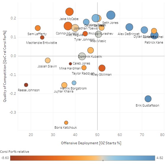
On the left (vertical) axis is the Quality of Competition. The higher this number is, the tougher the opponents each player was on the ice against. In this case, Boris Katchouk sees the easiest opponents/depth lines. But a big part of his number here is because of his time with Tampa. In general, the quality of competition that Tampa faces relative to their own is going to be lower than the competition Chicago faces – because Chicago is a weaker team (i.e. the opponents are tougher, by comparison). Erik Gustafsson also sees very weak quality of competition, which makes sense – we know how one-dimensional he is and what kind of defensive liability he is. Jake McCabe faced, on average, the most difficult opponents.
The size of the bubble indicates the average ice time. Obviously, the experienced defensemen would have the bigger circles here (as well as the star forwards).
The horizontal axis is the Offensive Zone Start %. Patrick Kane (of course) got the nicest zone starts – as you would expect. Gustafsson, Dylan Strome, prospect Lukas Reichel and Alex DeBrincat each saw favorable offensive zone starts. You're going to find that with most teams, either the top offensive players or the rookies in need of sheltered minutes will see the best zone start percentage.
And finally, the color. Blue is good. Dark blue is better. Brown is bad. The darker the blue, the higher the player’s CorsiRel (i.e. he drives possession because he's on the ice when his team gets more shot attempts). The darker brown indicates that the player tends to lose possession (negative CorsiRel) – the other team gets in the shot attempts. In this example, Mike Hardman, Mackenzie Entwistle and Reece Johnson struggled the most with possession. In their defense, they did see mainly defensive-zone starts. But clearly not having a solid checking line is hurting the Blackhawks. Kane, Jones and Gustafsson (thanks to his easier minutes) had the strongest relative Corsi numbers.
There you go. Quick lesson, maybe too quick, but this is fantasy hockey, not math class!
Related Posts
UPCOMING GAMES
Starting Goalies
Top Skater Views
| Players | Team | |
|---|---|---|
| TRAVIS KONECNY |
| |
| MARCO ROSSI |
| |
| COLE PERFETTI |
| |
| NILS HOGLANDER |
| |
| JJ PETERKA |
| |
Top Goalie Profile Views
LINE COMBOS
| Frequency |
| |
|---|---|---|
| 23.6 | RICKARD RAKELL EVGENI MALKIN MICHAEL BUNTING | |
| 22.6 | BRYAN RUST DREW O'CONNOR SIDNEY CROSBY | |
| 17.2 | JESSE PULJUJARVI JANSEN HARKINS JEFF CARTER | |
DobberHockey Podcasts

Fantasy Hockey Life: Florida Panthers with Colby Guy
Colby Guy joins the show to talk about the Cup champs. We discuss Sam Reinhart, Matthew Tkachuk, Aleksander Barkov, Sam Bennett, Evan Rodrigues, Anton Lundell, Mackie Samoskevich, Aaron Ekblad, Gustav Forsling, Nate Schmidt, Adam Boqvist, Sergei Bobrovsky and Spencer Knight. In-Goal Magazine’s Cat Silverman joins in our Cat’s Instincts segment to discuss Spencer Knight and […]
Fantasy Hockey Life: Boston Bruins with Fluto Shinzawa
Fluto Shinzawa of The Athletic joins Victor and Jesse to talk Boston Bruins. They discuss David Pastrnak, Elias Lindholm, Brad Marchand, Charlie Coyle, Pavel Zacha, Morgan Geekie, Matthew Poitras, Charlie McAvoy, Hampus Lindholm, Jeremy Swayman, and Joonas Korpisalo. In-Goal Magazine’s Cat Silverman joins in our Cat’s Instincts segment to discuss Brandon Bussi and Michael DiPietro. […]
Fantasy Hockey Life: Brian Hedger on the Columbus Blue Jackets
Brian Hedger of the Columbus Dispatch joins the show to look forward to next year’s Blue Jackets.
Fantasy Hockey Life: Nashville Predators with Bryan Bastin
Bryan Bastin of On the Forecheck joins Victor and Jesse to talk Nashville Predators. They discuss pros Filip Forsberg, Gustav Nyquist, Ryan O’Reilly, Tommy Novak, Luke Evangelista, Philip Tomasino, Cody Glass, Roman Josi, Alexandre Carrier, Juuse Saros, Kevin Lankinen, Yaroslav Askarov, Steven Stamkos, Jonathan Marchessault and Brady Skjei. In-Goal Magazine’s Cat Silverman joins in our […]
Fantasy Hockey Life: Toronto Maple Leafs with Cindy Caron
The Toronto Maple Leafs made it to a Game 7 overtime but were frustrated again in the playoffs. Recorded pre-free agency, Cindy Caron of I-Express.ca joins Victor and Jesse to go over the pro roster: Auston Matthews, Mitch Marner, William Nylander, John Tavares, Max Domi, Tyler Bertuzzi, Matthew Knies, Bobby McMann, Morgan Rielly, Timothy Liljegren, […]